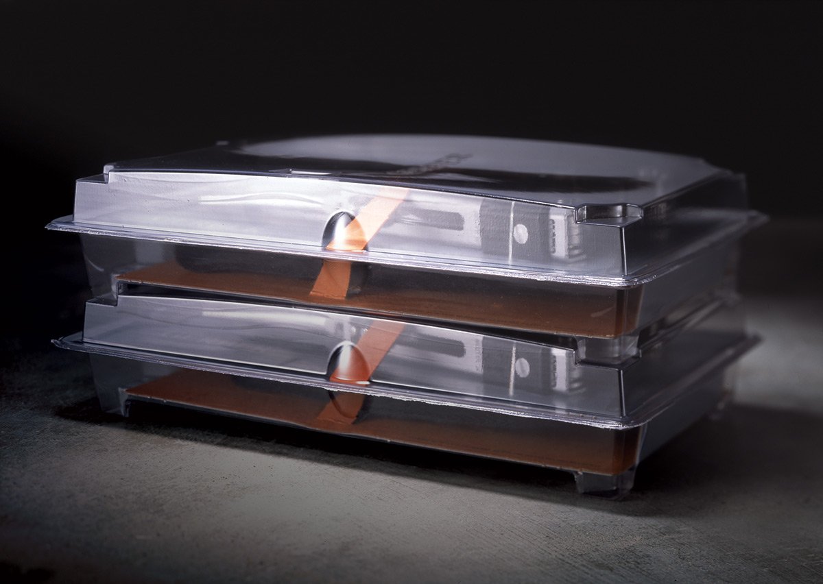
Gerber Gear Re-Branding + Packaging
Packaging Architecture + Graphic Design
As part of a wider re-branding project, while I worked for Sandstrom Partners, this Portland company asked us to redesign their entire line of 200+ SKU’s of knives and tools. Each SKU having a unique shape required quite a bit of brain time to ensure that a minimal amount of clam-shell shapes (ie-mold shapes) needed to be created. The resulting 6 package shapes produced allowed a sturdy, secure presentation with product as key visual. This projet fueled Gerber’s aggressive expansion into new markets and helped shape the brand as we know it today.


